Register Process UX Analisis

Koalaboox is in the middle of the Fintech technology transformation, which shows the need for a comprehensive update across the entire Web and App environment.
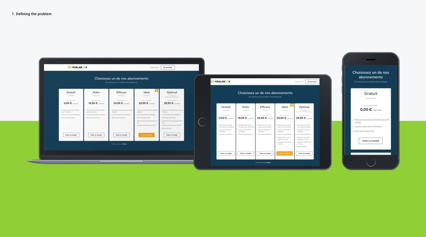
The Goal
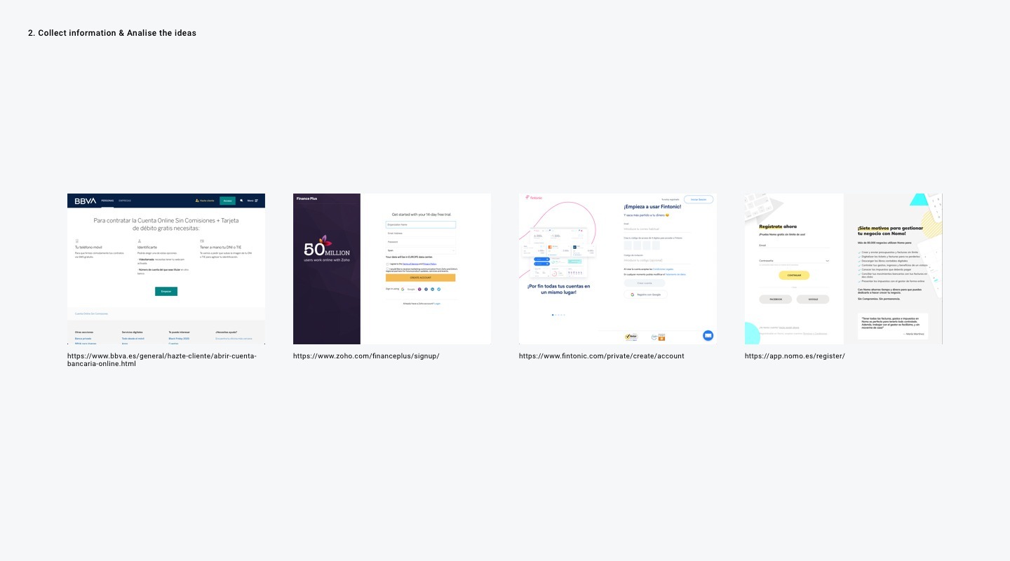
The key to this project was to create the Register process funnel as a profitability strategy for the company because having a pleasant experience when registering is essential for any website. After benchmarking with another registration process and following the best practices of UX, the project started with an extensive analysis of the banking and management platform’s websites (2018). We have seen an obvious need to simplify the registration process and make it like an easy starting point. We do not hesitate to introduce company information and eliminate all process interference to provide a clear structure and ensure that users complete all steps of registration.
Understanding the complexity of the registration process
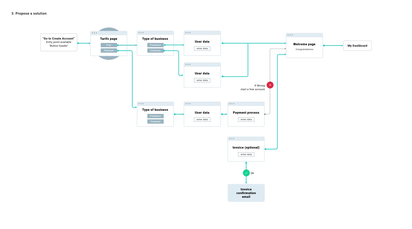
When I started putting these concepts into practice, I really discovered the complexity of such a large project. The previous version of the Koalaboox registration process was full of technical limitations and dependencies. We started with the version that just filled in the VAT number (by Country) and automatically filled out the form, but we found that there were many problems in this process, so we avoided this solution. Simplifying the process by having only two ways, the free access account and the paid account, which require access to payment processing programs was the best solution. So I worked with the team to develop a service that reduces complexity and provides always free access (if an error is discovered during the checkout process). This really helped us all come up with a realistic suggestion that developers can easily implement and maintain. Avoid getting stuck on large and complex systems, which can affect the user experience and frustrate teams that need upgrades.
Validating the designs
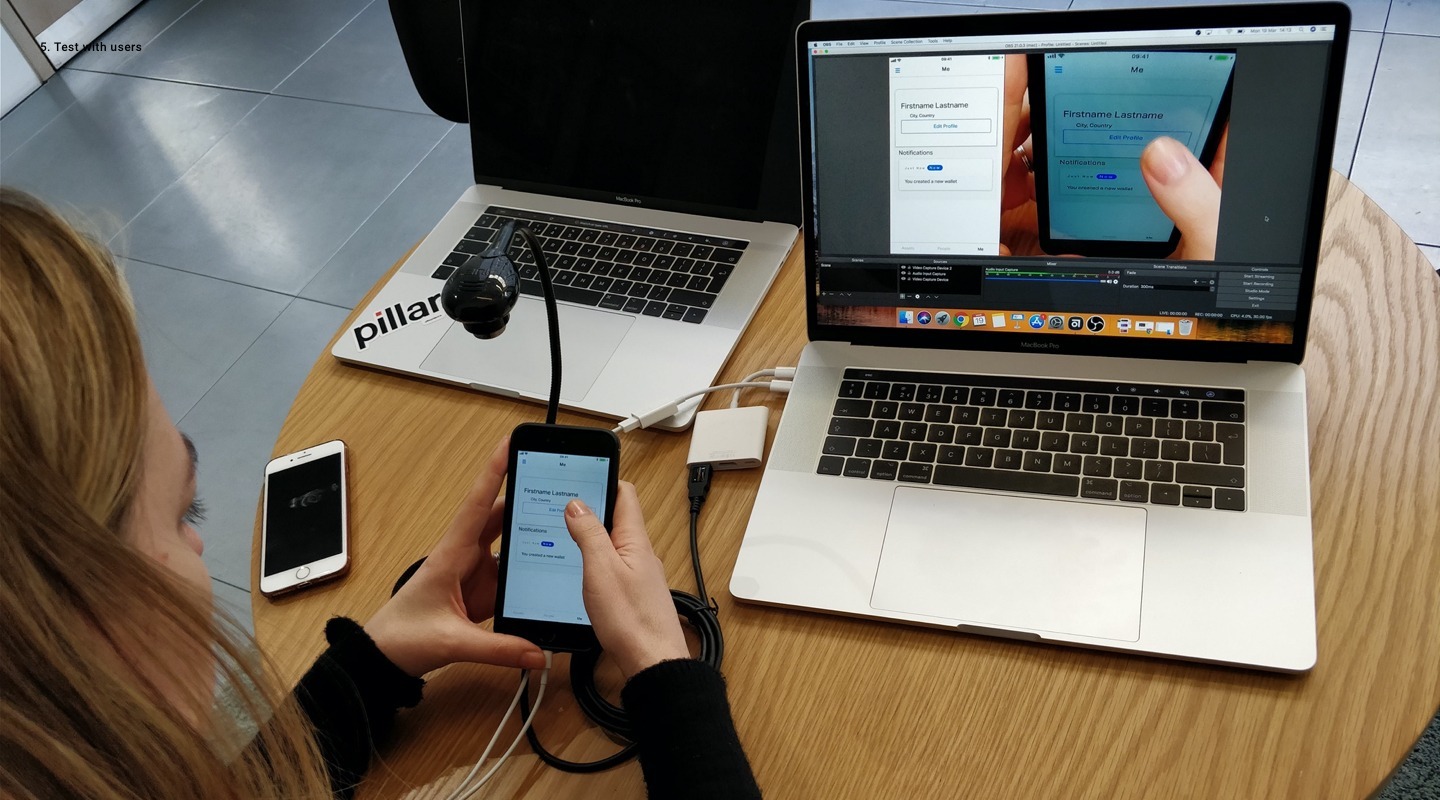
After conducting several internal usability test meetings with key users. The testing was generally task-based and the same user must perform the test task on 2 different versions of the prototype. The purpose was to compare the performance of the two versions (completion time, attractiveness, security, …) and verify which version is more user-friendly for our users. In addition to creating specific scripts for each test scenario, we also set up a basic survey with our researchers for each interview, no matter what experience they had. On this basis, we can extract the general profile of the user’s perception of the brand and compare it with our user roles. After internal meetings, we also use Hotjar to remotely verify other ideas such as the concept of entering the VAT number by country. This allowed us to quickly verify our hypothesis, and the result was less than 24 hours. The result was great. The process was been well verified, but not at the Step where companies search by the VAT number (used only in certain countries/regions). Through the analysis of the conversion rate of the entire Funnel, we found that many users were lost. We decided to cancel this step and immediately improved the conversion rate.
Date
noviembre 16, 2020